What every quilter should know about basic color theory and fabric coordination
Do you second-guess yourself when selecting fabrics? Unsure if the colors work together? Not anymore. AccuQuilt is covering the basics of color theory, and giving you the confidence to choose the perfect color combinations every time.
Color plays a vital role in creating beautiful projects, and understanding color theory is the first step to helping you nail your fabric selections with every quilt you make. You’ll be learning the same principals used by designers, artists, and photographers—and we won’t even charge you for college credits. So get ready: here comes color theory 101.
The color wheel—a helpful tool

Color theory begins with the color wheel—a representation of all the colors in a handy visual form. You’ll notice the primary colors (red, yellow, and blue) are on different sides of the wheel. The primary colors are those that cannot be created by mixing any other hue. In fact, all other colors are derived from these three primary colors.
Secondary colors are those that are created when two primary colors are mixed, like orange (red and yellow), green (yellow and blue), and purple (blue and red).
In between the primary and secondary colors you’ll find the tertiary colors. These are combination colors, like aqua (green-blue) and vermillion (red-purple). They add depth and interest, allowing you to expand on the palette for whatever you’re creating.
Color theory is built off of the color wheel, so it’s good to keep one handy as a quick reference.
Harmonious color themes
Choosing the right colors for a piece creates harmony—a feeling that everything is how it should be. Likewise, choosing the wrong colors creates visual dissonance—the feeling that something is just “off.” It’s the difference between a piece feeling energized versus too-intense, or relaxing versus boring.
There are reliable color themes that will always create visual harmony, so when in doubt you can always fall back on one of these combinations.
- Analogous colors: Analogous color themes are created when any three colors that are next to each other on the 12-color wheel are used. Examples of analogous themes would be blue, green-blue, and green or yellow, yellow-orange, and orange. Typically when the analogous theme is used, one color will be dominant, and the other two used as accents.
- Complementary colors: Complementary colors are those that are completely opposite each other on the color wheel. The complementary of red is green, yellow is purple, and blue is orange. Using complementary colors together creates a theme that naturally works. For example, shades of yellow-green and purple-red would be complementary, and create harmony in your project.
- Split complementary: This color theme tends to be very vibrant and works best when one color is used as the main color while the other two are used as accent colors. The split complementary theme is similar to the complementary theme, but instead of using the color that’s exactly opposite the main color, you choose the two colors on either side of it. For example, if your main color is green, instead of choosing the complementary of red, you would choose red-orange and red-violet.
Contrast and context
The same color can look completely different when placed against other colors. For example, red looks more vibrant against black, while it almost disappears against orange. That’s because of the contrast and context. The same hue will have different contrasts in different contexts.
Some color combinations are high contrast, like yellow and blue, and some are low contrast, like yellow and green-yellow. The closer together the colors are on the color wheel, the less contrast they’ll have. Neither high contrast or low contrast is better, it depends on the feeling you’re looking to create. If you’d like your project to have a soothing, serene feeling, colors like blues and greens that flow into one another would be a much better choice than high-contrast reds and yellows.
Contrast tints and shades

All the colors are in the color wheel as pure forms, but more hues can be created by adding black or white. Adding white to a color lightens the hue and creates a tint. Adding black darkens the hue, creating a shade. Using tints and shades creates contrast, and therefore visual interest.
High-contrast tints and shades—those that are very dark and very light, are eye-catching when paired together, and ideal for parts that you want to highlight. Conversely, low-contrast shades and tints—those that are closer together, are more subtle and great for backgrounds.
Hot and cold
The ways you use warm and cool colors can totally change the look and feeling of your quilt. Warmer colors are those like red, yellow, and orange, while cooler colors include blue, green, and violet. Using an analogous theme that features all warm or all cool colors provides a completely different look than mixing warm and cool. Mixing the two can provide striking contrast.
Some fabrics—like red-violets or yellow-greens—can be hard to read. If you can’t tell if the fabric reads more warm or cool, put it against other fabrics and see where it falls.
Putting it into practice
Color theory is important to know as a quilter, and it can help guide you in making fabric selection decisions. But color theory is only part of it—the other part is your personal preference. Complementary colors are great, but maybe you don’t like to use red and green together outside of the holidays. Or maybe bright, clear colors aren’t your deal. Do what you’re comfortable with.
On the flipside, if you find yourself in a color rut, pull out your handy-dandy color wheel and start following color theory to try out different combinations. Gather your fabrics and try them together. You may find a new combination you never thought of using together.
Combining color theory with your preferences will help you create unique, beautiful quilts that are oh-so-you. So grab some fabric and get started. And show us what you came up with. We love to see your creations. Happy quilting!

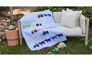
Free GO! Piece of My Heart Quilt Pattern